Brand Guide and Resources
Color Palette
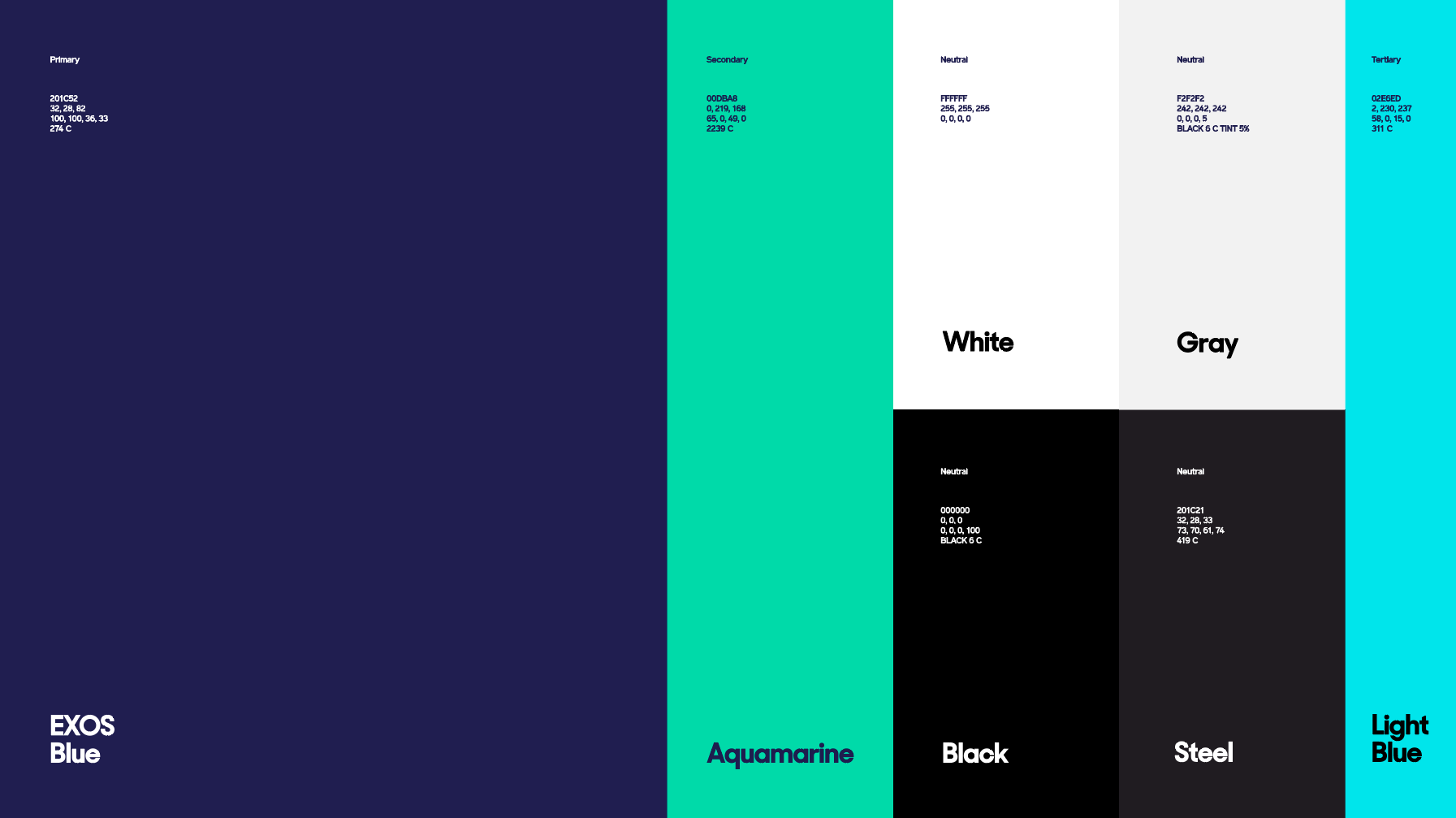
Our foundational palette of Exos Blue, Aquamarine and Bright Blue, alongside our Neutrals, gives us the basis to make a bold impression across all applications and environments. In the future, the use of materials for print and physical spaces will be explored further. Textures, surfaces and unique materials should all be considered in allowing us to best reflect the essence of the brand.

EXOS Blue (Primary):
HEX: 201C52
RGB: 32, 28, 82
CMYK: 100, 100, 36, 33
PANTONE: 274 C
Aquamarine (Secondary):
HEX: 00DBA8
RGB: 0, 219, 168
CMYK: 65, 0, 49, 0
PANTONE: 2239 C
Bright Blue (Tertiary):
HEX: 02E6ED
RGB: 2, 230, 237
CMYK: 58, 0, 15, 0
PANTONE: 311 C
Black (Neutral):
HEX: 000000
RGB: 0, 0, 0
CMYK: 0, 0, 0, 100
PANTONE: BLACK 6 C
Steel (Neutral):
HEX: 201C21
RGB: 32, 28, 33
CMYK: 73, 70, 61, 74
PANTONE: 419 C
Gray (Neutral):
HEX: F2F2F2
RGB: 242, 242, 242
CMYK: 0, 0, 0, 5
PANTONE: BLACK 6 C TINT 5%
White (Neutral):
HEX: FFFFFF
RGB: 255, 255, 255
CMYK: 0, 0, 0, 0
Color Rules
As with everything, it’s a balance. And we must be considered in the way we use our color palette. We have created a color hierarchy and ratio system that ensures our palette works together in harmony. Collateral that reflects this balance delivers a unified look and feel plus demonstrates our distinctive approach to color. When we move into more non-traditional media and touch points, such as swag and physical environments, those canvases give us license to be even more expressive with our palette.
.png)
Color Accessibility
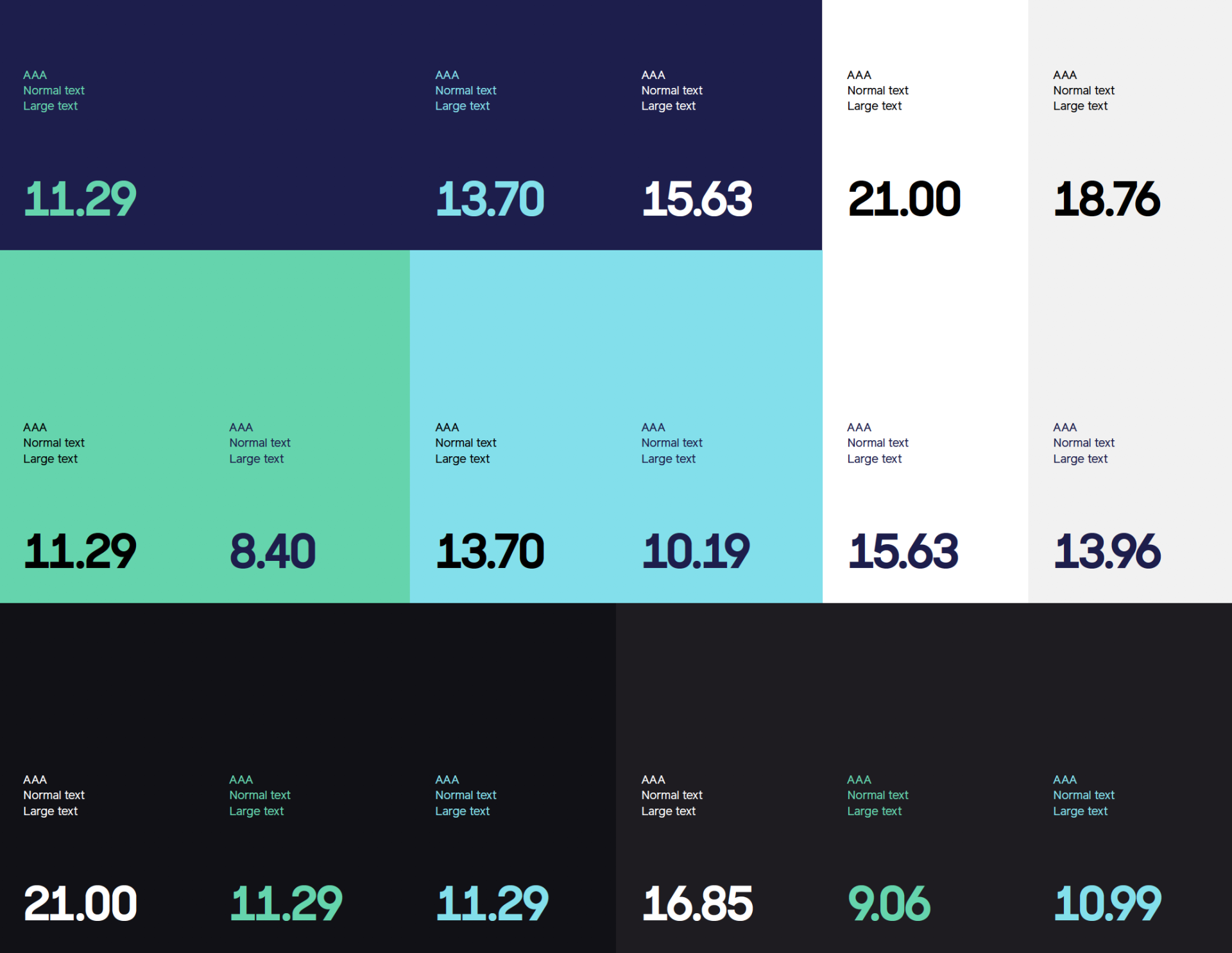
Our choice of color combinations for digital and print will play a critical role for accessibility. These examples call-out the combinations that provide the highest contrast and should be used whenever possible. As a guide, adopt combinations that pass at least AA, and ideally both AAA and AA.
