Brand Guide and Resources
Logo
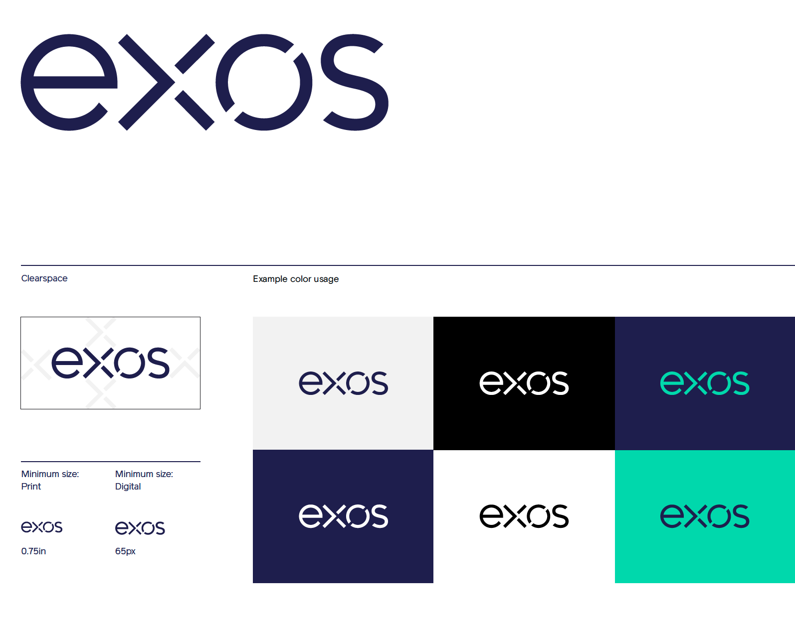
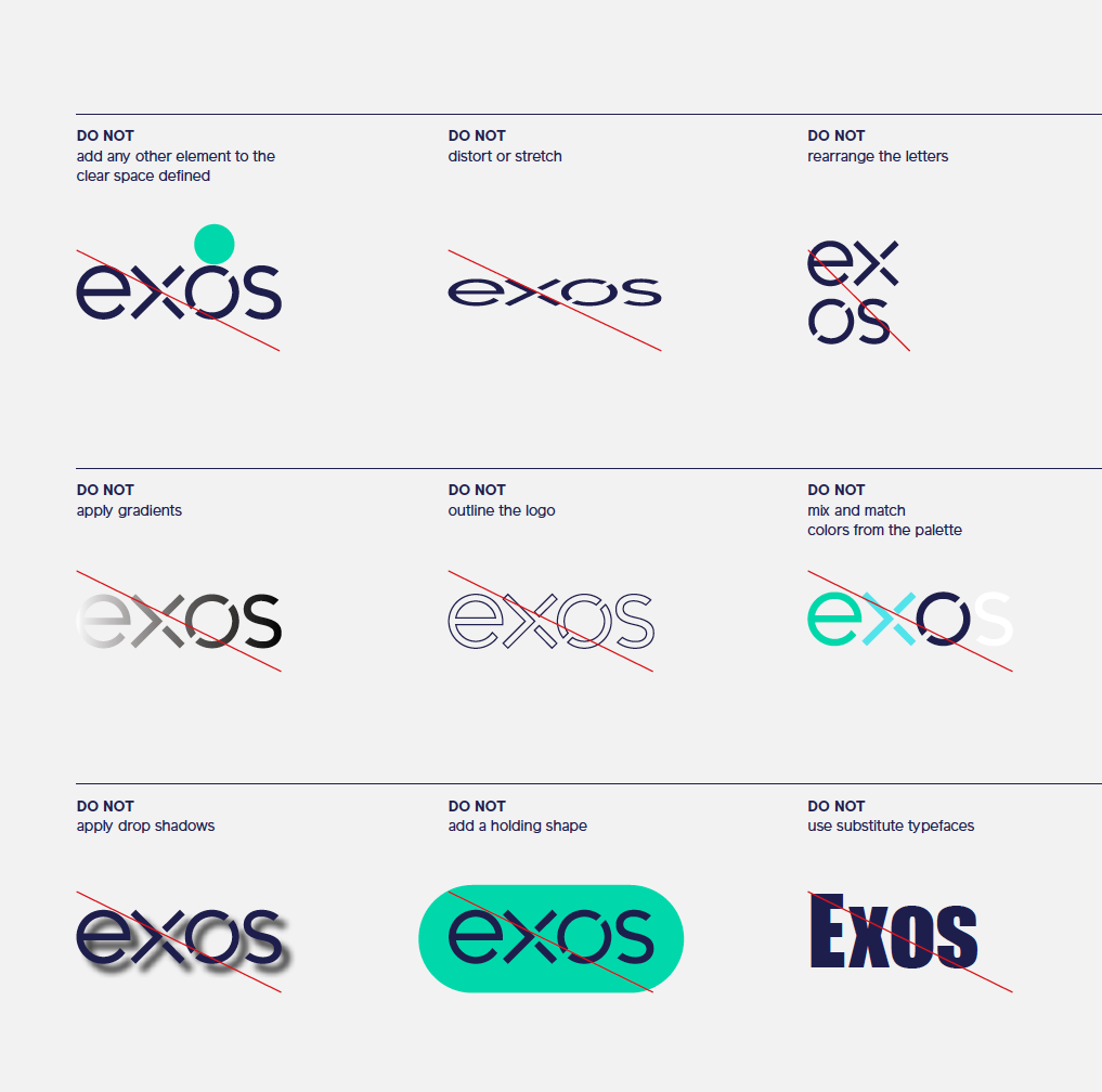
Our logo is made up of more than four letters. It encapsulates the core essence of our brand and has been designed to make an indelible mark on the world. It should therefore never be modified. Only protected.

Color
The default appearance is in Exos Blue. Secondary and tertiary colors can be used in collateral for expressiveness and vibrance, and White or Black in instances that require high contrast or have monochrome constraints. Possible combinations and accessibility rules are outlined on page 38. When considering how the logo might live in physical environments, start with materials (ex. metal) instead of applying color.
Clear space
It’s always legible and has enough clearance from headlines, text and visuals. The clear space is defined by using the height of the ‘x’ character from our logo.
Minimum size
Size minimums have been defined based on the legibility of the wordmark, in its entirety. "Exos" When written in plain text, "Exos" should always appear in title case, not all caps or lowercase.

Right click and save as to download